SinSally Logo Design
As always, feel free to contact us if you have any questions!
Logo design #1
The first logo design concept we created features the solid gold appeal featuring the same font we used in the Sinful Salon logo. A cool twist with the gold triangles inside the lips for a modern feel. Heavy accented S and Y lettering.


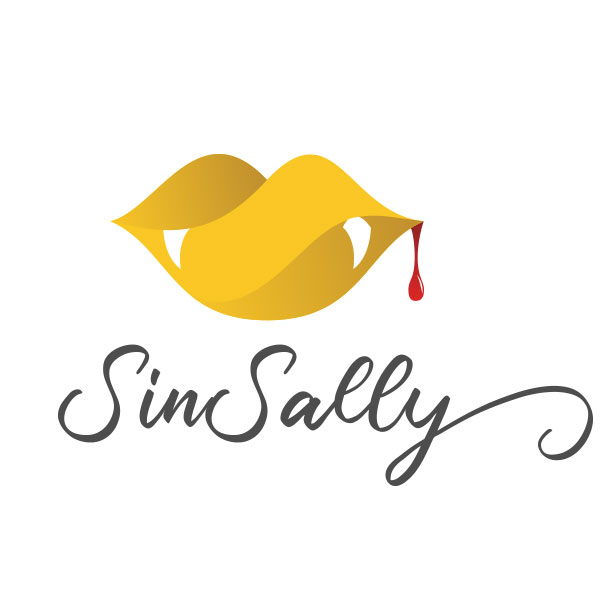
Logo design #2
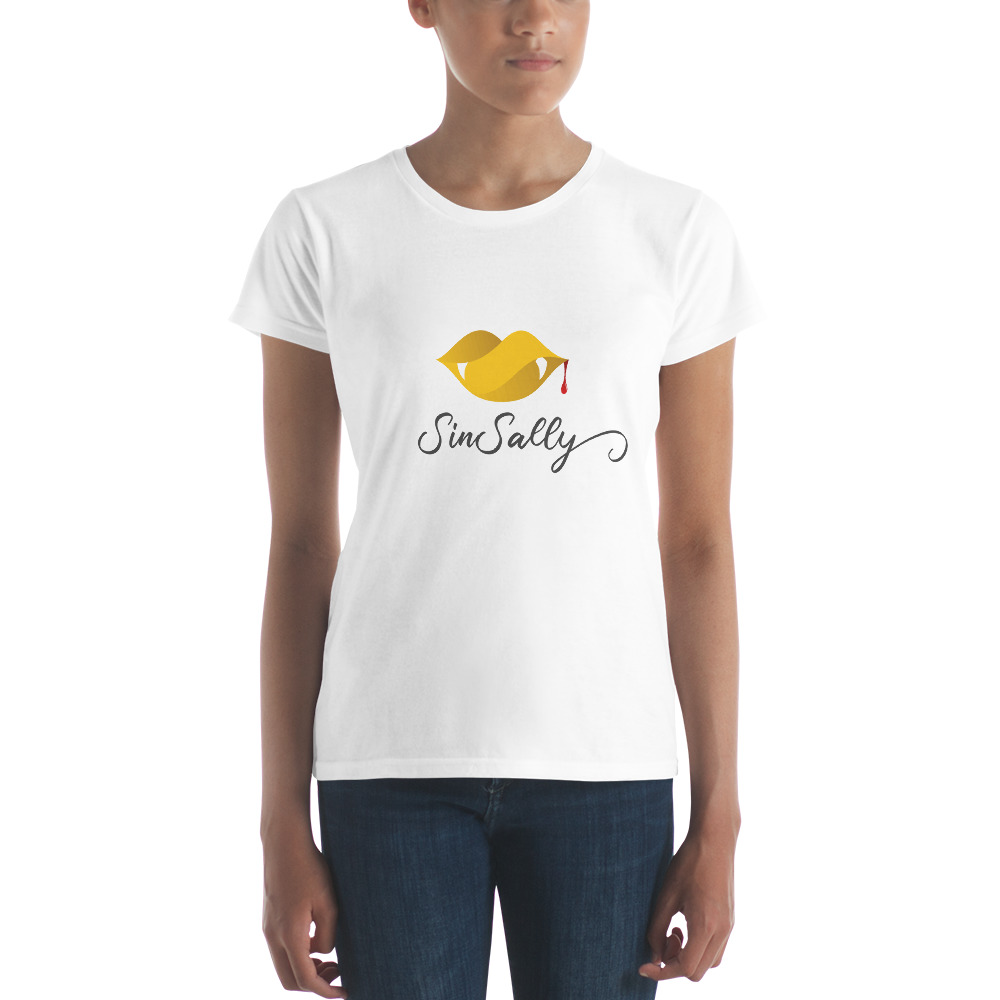
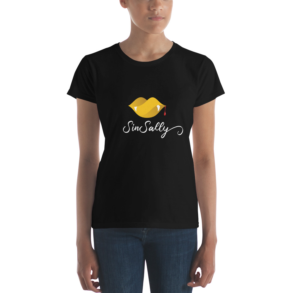
This next logo design concept we were aiming for vividly bold with the goldish gradient. Featuring the blood drip and the fangs for that give it the “goth” look. The bright colors still make this logo fun and inviting. The font is playful, yet with the hand-written style, it has almost an unsettling sinister-ish feel. Since this version of the logo has the dark grey text, this logo comes with an additional “light” version of the logo featuring white text (as displayed below).
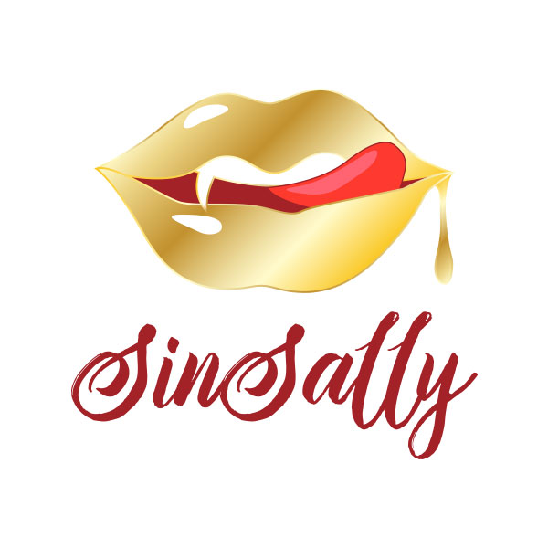
Logo design #3
The 3rd and final logo design concept we created is smooth, bold, and easily recognized. Like the other 2 designs, this one features the blood drip. The one solid fang really sets the feel for the gold blood drip. We were able to digitize the tongue on this one while still keeping the elegant visual appeal. The darker red really makes the gold “pop” without drawing away too much attention. This one is probably my favorite of the 3.